Chart data table is a feature of charts, that presents in the chart area a data table with the values that are visualised by the chart. The data table is positioned automatically at the bottom of the chart, and can for certain chart types replace the X-axis labels. Until now this feature has been missing in LibreOffice, but thanks to the funding of NGI, it is now implemented.
This project has received funding from the European Union’s Horizon 2020 research and innovation programme under grant agreement No 871498 |
 |
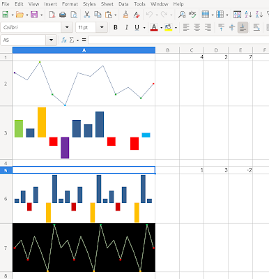
| Figure 1: Charts with a data table |
Chart data table usage and description
 |
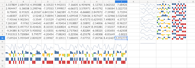
| Figure 2: Insert data table dialog |
The chart data table can be added to the chart from the menu (Insert -> Data Table...), where it is possible to select to show the data table and set the data table specific properties (see Figure 2). The data table specific properties are:
- Show Horizontal Border
- Show Vertical Border
- Show Outline
- Show Keys
The properties "Show Horizontal Border" and "Show Vertical Border" control if the inner horizontal or vertical borders of the data table are shown or not. The "Show Outline" controls if the outline - borders around the data table are shown or not. "Show Key" controls if the legend keys for the data series are shown in the data table in addition to the data series (row) names.
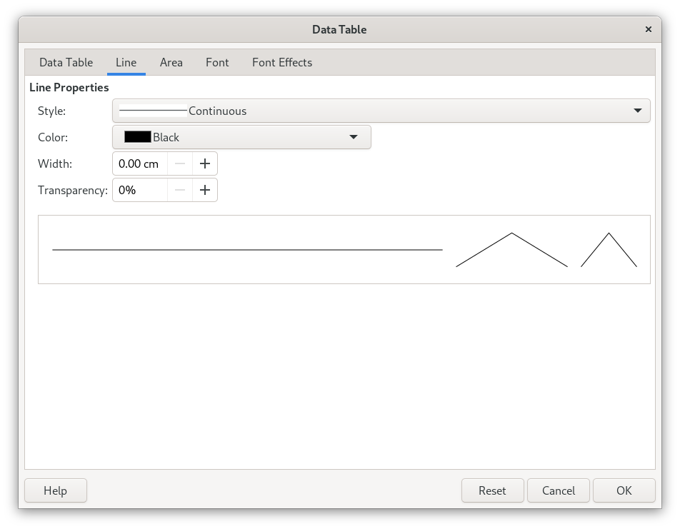 |
| Figure 3: Data Table Dialog |
In addition to those data table specific properties it is also possible to change the line, fill and font properties of the data table (see Figure 3). For example the line properties define how the borders (lines) will be shown, so it is possible to change the line style (continuous line, dashes, dots), the colour of the line, transparency, line thickness. The fill properties defines the colour of the cell background and the font properties what font and size the is used for the text in the data tables.
Implementation
The data table implementation is located in the chart2 component, like all the other chart related code. A data table is represented in the model by a new DataTable (chart2/source/inc/DataTable.hxx) class (extending the XDataTable interface) and lives on the "Diagram" object. If there is no DataTable object, it means the data table is turned off. The DataTable holds the data table specific properties as well as line, fill and font properties.
The automatic positioning of the data table is done similar like the x-axis labels, as the data table is also meant to replace the x-axis labels, unless it is not able to do so, because of the chart type (for example the "bar chart", which has the main x and y axis swapped).
Rendering is done on the DataTableView class (chart2/source/view/inc/DataTableView.hxx), which creates a table shape and positions that into the chart. The row headers (data series names) and column headers (x-axis names) and values (from the data series) are filled into the table cell by cell, where also the cell properties are mapped from the model (DataTable class), so the data table looks correctly.
Document format support
Data table is supported by OOXML (c:dTable element). There was already present reading and writing of the basic data table properties ("horizontal border", "vertical border" and "outline" but not "keys") to preserve the document formatting even when LibreOffice couldn't render the data table itself. The properties however were not present at a convenient place (directly on the Dialog object in the model) so this had to be refactored to use a DataTable class instead. Now the OOXML support can not only preserve the complete properties (including line, fill, font) and of course also render the data table properly.
Support for the ODF format had to be added into the LibreOffice extended namespace. This was done with a "data-table" element that was added to the "chart:chart" element. The "data-table" element only has a link to a certain style instance (linked with "style-name" attribute to a style:style element with the same "name" attribute). The data table specific properties are attributes of the "chart-properties" element ("loext:show-horizontal-border", "loext:show-vertical-border", loext:show-outline", "loext:show-keys" attributes), that can be added to a style. The style can also have "graphic-properties" and "text-properties", which are mapped to line, fill and text properties of the data table on import (and vice-versa on the export).
The support for the data tables is currently available in LibreOffice master and will be present as a feature of LibreOffice 7.5 when released.